Appearance
Choosing Type for the Web
When selecting type for digital projects, readability and legibility are the primary criteria. A typeface must remain clear at the sizes intended for use to prevent users from abandoning the site.
Optimised Resources
Licensing is important to consider when you're picking a font. Even though 1001freefonts.com has 65,000 free fonts, your ability to embed them and use them in a website is not guaranteed. For this reason, the go-to library for free web fonts is Google Fonts, followed by Font Squirrel, especially if you want something a little quirkier for a personal project.
Variable fonts are particularly beneficial as they offer a wide array of styles in a single file, which can improve site performance.
Effective Pairing
To create visual hierarchy and contrast, designers can pair fonts in three ways:
- Using the same typeface family or a superfamily (e.g. Roboto and Roboto Slab).
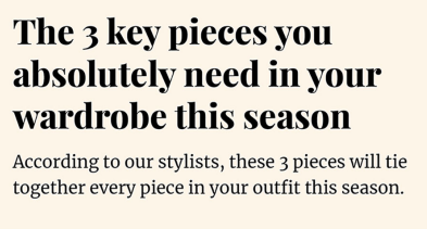
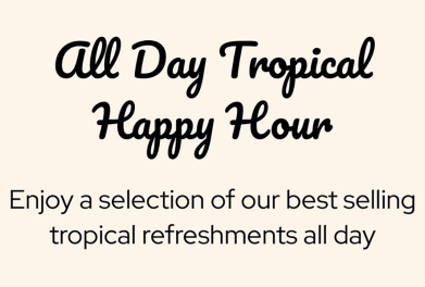
- Pairing different categories, such as a playful script with a round sans serif.
- Pairing the same category but choosing fonts with contrasting letter styles (e.g. a geometric sans serif with a condensed one).
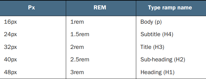
Establishing a Type Ramp
This set of guidelines defines the sizes and styles for headers (H1–H4), body text, and captions to ensure consistency across the entire website.
Hierarchy: Heading → Subheading → Title → Subtitle → Body → Caption
Sizing and Units
Avoid pixels for font sizing; instead, use relative units like rem or em to ensure the design is accessible and responsive.
← Previous: Type Basics | Back to Typography | Next: Vertical Rhythm →