Appearance
Color Terminology
To effectively work with colour, one must understand the specific terms used to describe its properties and variations:
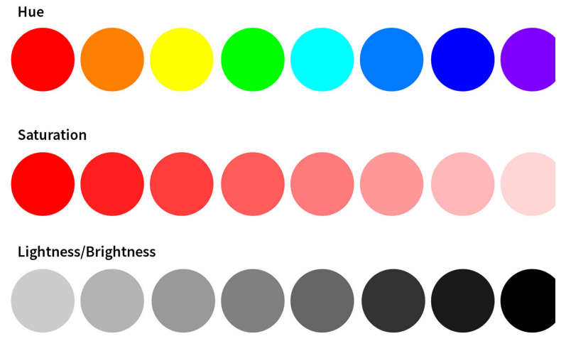
Hue, Saturation, and Lightness
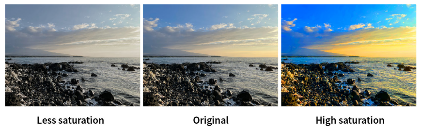
Hue refers to the pure base colour without any added black, white, or gray. Saturation measures the vividness or intensity of a colour on a scale of 0 to 100. Lightness (or brightness) refers to how light or dark a colour is based on the amount of white or black it contains.
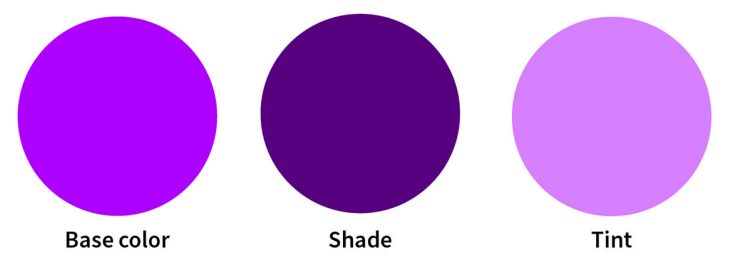
Shades, Tints, and Tones
These are variations of a base hue created by adding other elements. Shades are created by adding black to darken a hue; tints are created by adding white to lighten it; and tones are created by adding gray to dull the colour.
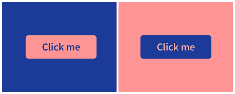
Color Temperature
Colours are broadly categorised into warm (red, orange, yellow) and cool (green, blue, purple) groups. Warm colours are energetic and attention-grabbing, often appearing to move forward in a composition, while cool colours are calming and tend to appear more recessed. In the following example, notice how the red button on the left visually appears more forward than the blue button on the right.