Appearance
Picking a Color Scheme
Creating a professional colour palette requires a structured approach rather than guesswork.
The 60:30:10 Rule
A helpful guideline for balance is to use a primary colour for 60% of the space, a secondary colour for 30%, and an accent colour for 10%.
Selection Process
Designers should start by picking one base colour to dominate the UI, followed by one or two accent colours.
TIP
If you’re stuck trying to decide on a color scheme, think about the kind of feeling you want to evoke from your design and pick primary colors based on that. You can use the color psychology page for this.
TIP
When picking color schemes, use the color wheel to identify color relationships.
Neutral Palette
A set of gray swatches should be developed, ideally with a hint of the primary brand colour mixed in to ensure the neutrals feel cohesive with the rest of the design.
Application
Base colours are typically applied to primary headlines and main call-to-action buttons, while secondary and muted tones are used for backgrounds and secondary UI elements.
Building a Cohesive Color Scheme
Stephanie Stimac demonstrates in her book how to build a cohesive monochromatic color scheme using the HSB color slider, beginning with a primary violet-blue hue. From this base color, she generates two additional variations by reducing the saturation slider to 60% and 10%, which results in a medium tone and a very light tone suitable for text overlays. To ensure the neutral elements of the site feel integrated, she creates a gray palette by keeping the same hue value but reducing the saturation—starting at 20% for the darkest gray to maintain a hint of the brand color—and adjusting brightness levels for lighter variations.

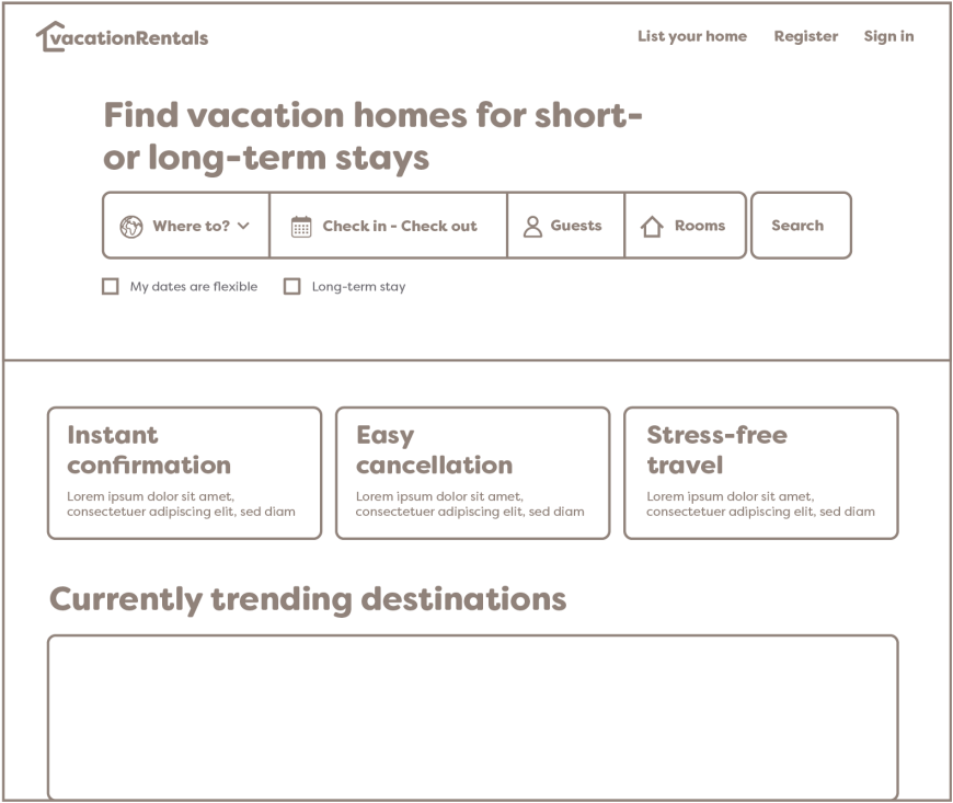
When applying this palette to a high-fidelity wireframe, she assigns the most vibrant base color to the most critical interactive elements, such as the main headline, the search button call-to-action, and the fill for checked boxes. The secondary accent color is applied to the logo to provide brand identity without competing for attention with the primary search function. The third and lightest color variation is utilized as a background for secondary information tiles, creating a distinct visual area that is noticeable but secondary to the main content.
For the site's typography, she uses her darkest gray shades for headlines, navigation, and subheadings to maintain strong readability, while a more neutral gray is applied to body copy and form text. This structured application of color defines a clear hierarchy, leading the user's eye through the page effectively. Finally, she highlights the importance of accessibility by adding an opacity layer to background imagery, ensuring that overlaid text remains readable and high-contrast against the visual elements.

← Previous: Color Psychology | Back to Color Theory | Next: Implementing Color for Digital Screens →