Appearance
Using a Grid
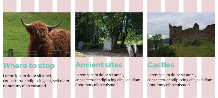
A grid system acts as an organisational tool, consisting of columns, rows, and the gaps (gutters) between them. By aligning items to these vertical columns, designers create invisible hard edges that provide a sense of order and structure, even in experimental or asymmetrical designs.

Key Considerations
Key considerations for grid dimensions include:
- Column Counts: Standard practice involves using 12 columns for desktops, 8 for tablets, and 4 for mobile devices.
- Container Width: Designers must define a maximum width for the website's container, ensuring content does not extend beyond this defined vertical boundary.
- Flexibility: A grid with more columns offers greater flexibility, allowing content to span multiple columns to create varied widths for different sections.
- Rows: Unlike columns, rows are typically defined by the length of the content itself rather than being strictly fixed in the design phase.
Key Takeaway
Creating a grid system for your website ensures that even the pages that don't share the same layout have the dimensions and ratios of the columns. Whether your content is one or three columns wide, the dimensions can scale up or down, and the site has a sense of balance even as the layout changes between devices.