Appearance
Choosing a Layout
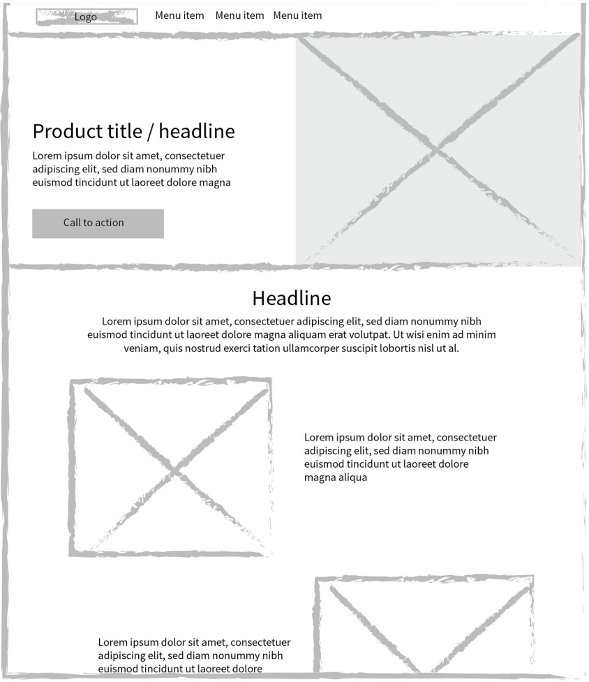
The choice of layout depends on the specific goals of the page and the type of content being displayed. While homepages often mix the number of columns per section to divide snippets of information, subpages should maintain a consistent template to prevent user confusion.
Common Layout Patterns
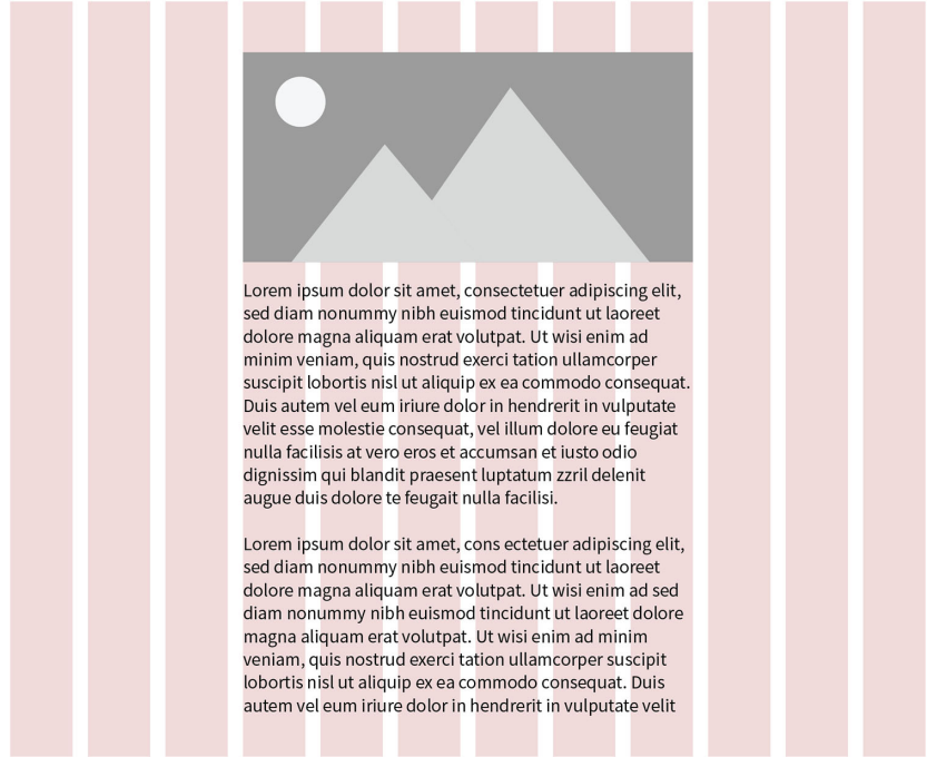
One-Column Patterns: These are most effective for text-heavy pages like articles or blog posts, where a single stream of content aids focus.
Multi-Column Patterns: These are often used for landing pages to display highlights and snippets.
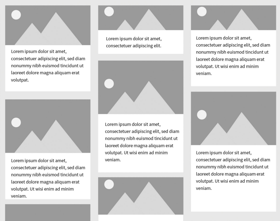
Masonry Layouts: In this pattern, vertical space is filled regardless of an item's height, creating a dynamic feel for visual content like image galleries or cards.
Reading Patterns
Design should be informed by how users scan:
Z-pattern: Users follow a "Z" shape on pages with minimal text, such as homepages.
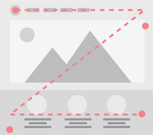
F-pattern: Common on text-heavy pages where users hunt for efficiency; designers should use subheadings and bullets to break up these "walls of text".
← Previous: Using a Grid | Back to Layout | Next: Responsive Design →