Appearance
Responsive Design Considerations
Responsive design ensures a cohesive experience across all devices by creating fluid layouts that adapt to various screen sizes. Mobile design should not be a miniature version of a desktop site; instead, it requires reducing content clutter and focusing on the user's primary tasks.
Essential Mobile Considerations
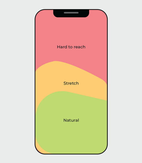
Designing for Touch: Interactive elements must be large enough for thumbs, and critical actions should be placed within "natural" thumb zones.
Content Chunking: Long tasks, such as payment forms, should be broken into smaller, manageable steps to reduce cognitive load.
Clutter Reduction: Menus and secondary content should be hidden behind interactive elements like overlays or accordions to keep the screen clear.
Consistency: While sizing may change, visual styles like typography and brand colours must remain consistent to maintain familiarity.
Emerging Tech: Multiscreen and foldable devices offer opportunities for enhanced experiences, such as displaying ingredients on one screen while showing recipe steps on the other.